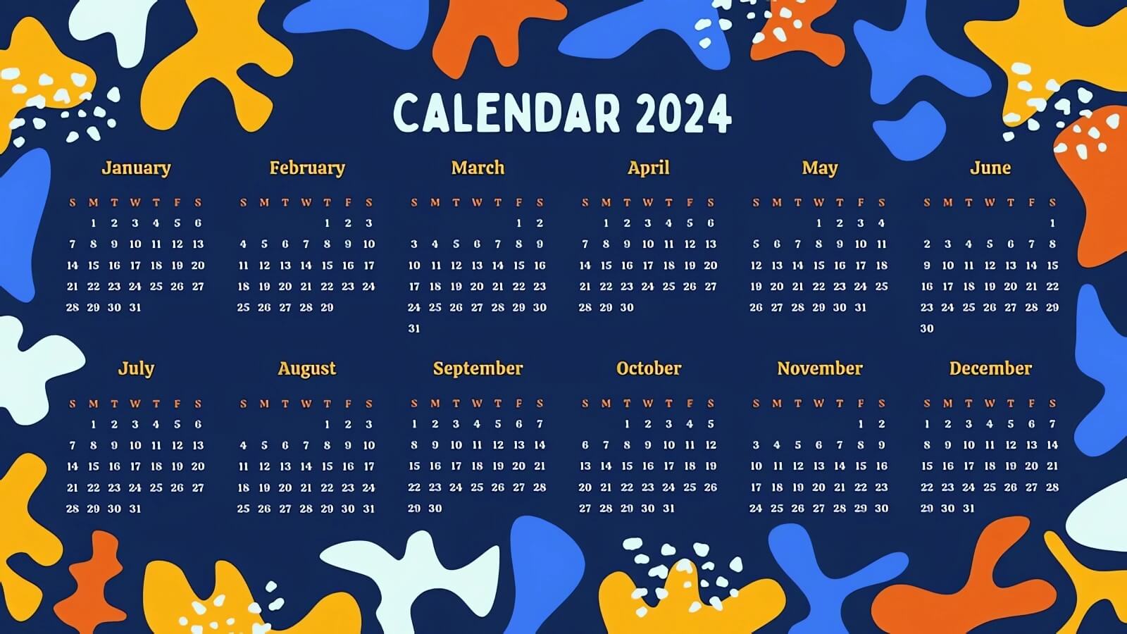
In my creation, each month out of twelve is represented visually by bright artworks. For better visibility of days, the figures in the illustrations are in white against a matte blue background. So that the white figures do not blend into the month names, the names are written on the yellow background and the first letters of the days are put under the month header.
There are some essential things about this work: Initially, for lifelike preparation, I made a matte blue page of 1600×900 pixel resolution. I picked up gentle colors to define the look of my bright 2024 calendar. As a source of the graphic, I took the objects to be stars which were drawn randomly. The blue, yellow, orange, and white shapes cover the corners of the sheet, going beyond the layout.
More than that, the order of the months and days is very crucial as well. Being aware of the most important aspect of the calendar, I wanted to give it a more work and focus feeling which is typical for planning. The first thing I had to do was to select the colors for the numbers and the month titles. Because the numbers were the most important things in the format, I decided to make the day numbers white.
At the same time for the words denoting months to be easily recognizable, I made them yellow. I used a big font for both and the layout with a divided table of width and length so each month could be easily separated from the others. Finally, it was one of the very few and, therefore, most significant things – the name, which was done in large, bold characters in order to give the highlight to the calendar picture. That is the reason why a broad font style was my choice.
If realistic designs are what you want, then this one is for you. It is a fully graphic look with a playful design that results in nice-looking work. I share this plugin with you at no cost, but you are worth even more. The articles that I have recently posted concerning the 2024 calendar visuals will make things clearer for you.
You may see more plans if you wish by checking out the links bellow:

Leave a Reply
You must be logged in to post a comment.